
The Basics of Statistics
During your time as a student you will need to analyze and present data and therefore need to understand the basics of statistics.
In this article we present statistics for university students, statistics that any student may need during their studies.
These are the simple statistics that you are required to know as be able to use for your assignments, but are not understood or covered at school.
Although some subjects may require a greater degree of complexity (e.g. computer science), all students need to know the basics of statistics and when to use them.
Measures of Central Tendency
The three main measures of central tendency are mean, median and mode. We often refer to the mean as the ‘average’ of numbers.
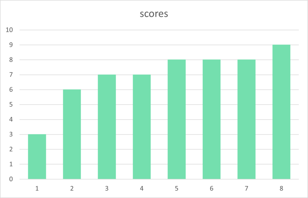
Using an example of a series of scores, we can locate the central tendency of the numbers using these three measures. Our example scores are:
8 9 3 6 7 8 8 7
Each measure of central tendency is explained below, in summary, the scores have a median of 7.5, a mean of 7, and a mode of 8.
The analysis of the scores shows most numbers are in the range of 6 or 7 to 9 with the isolated score of 3 an outlier, a score that greatly differs from the norm.
An simple method of analyzing the data is to visualize it, such as in a chart or graph. If the scores are in order it is easier to understand trends and patterns.
Mode
There are 8 scores ranging from 3 to 9 (a range of 6) with the most popular number 8 occurring three times. Therefore the mode of these scores is 8 as it is the number that occurs the most.
Mean
The sum of the numbers is 56 (8+9+3+6+7+8+8+7), therefore the mean, or ‘average’, of the scores is 7, as the sum of 56 divided by the amount of numbers, 8, equals 7.
Median
To calculate the median we order the scores and find the middle item.
3 6 7 7 8 8 8 9
As there are an even amount of numbers, there are two scores in the middle, both 7 and 8. To calculate the median in this situation we add the numbers and divide by two, giving a median of 7.5.
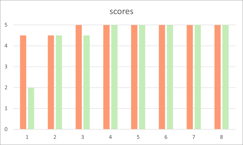
In another example we compare two series of ratings seen on the bar chart above. The first series of ratings are:
4.5 4.5 5 5 5 5 5 5 5
These have a mean of 4.88 which is close to the top rating of 5 as you would expect as six of the eight ratings are 5 and the other two are the next highest score of 4.5.
Both the the mode and median of these ratings is 5.
The second series of ratings is identical with one exception, a rating of 5 is lowered to 2. So only one rating is different. The second series of ratings is:
2 4.5 4.5 5 5 5 5 5 5
Although both the median and mode are unchanged the mean has dropped to 4.5. Therefore the mean ‘average’ is greatly affected by the outlier, the rating of 2.
This may not seem important or significant, but when users are given a list of courses in order of average ratings a course with the first series of ratings would be at the top, whilst the second would be dramatically dropped in the pecking order.
The reduction in interest in the course would be significant, although it is only one rating that has changed the very popular course with high ratings.
The insight we can see is that the mean can be affected by outliers.
Distribution and Variation
In some instances we are interested in the spread of data, how much does the data differ between scores. This is known as the variance.
Range
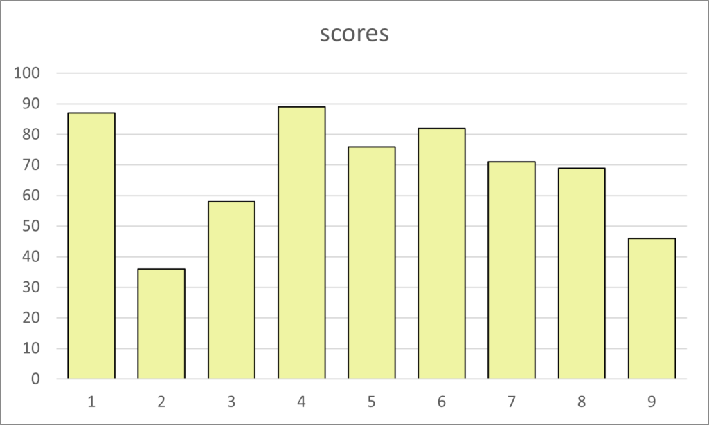
The bar chart above shows the distribution of scores between 0 and 100. There are nine scores that have the lowest value of 36 to the highest value of 89. We can say the scores have a range of 63
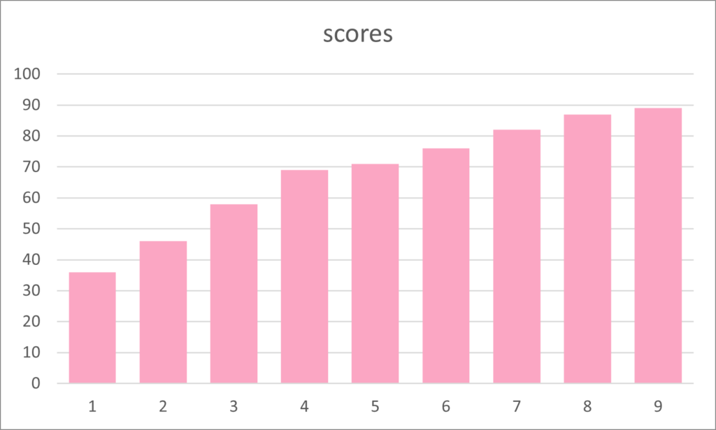
Again, the ordered scores are easier to analyze and visualize. In the same bar chart, but the scores ordered, it is easier to see the range of scores from 36 to 89.
| 36 | 46 | 58 | 69 | 71 | 76 | 82 | 87 | 89 |
When we see the nine scores in order it is easy to see the median score of 71, which is the fifth bar in the chart.
Quartiles
Although in our example there are only nine numbers, other data sets are larger and it is possible to split the set into four groups to see the lowest or first quartile of scores, from the next 25%, the third quartile of scores from 50% to 75%, and the highest scores in the fourth quartile.
In our example the median is 71 and the quartile boundaries are at 52 for the first quartile and 84.5 for the third to fourth quartile. This has the following result:
- 1st quartile: 36 46
- 2nd quartile 58 69 71
- 3rd quartile 76 82
- 4th quartile 87 89
If a number falls on the border between two quartiles then it is in the lower of these quartiles.
In the example, the score of 71 equals the median, the border between the second and third quartile. The first 50% are in the first and second quartile therefore 71 is in the second quartile range.
The quartile values are calculated as follows:
- Lower quartile (Q1) = N + 1 multiplied by (1) divided by (4)
- Middle quartile (Q2) = N + 1 multiplied by (2) divided by (4)
- Upper quartile (Q3) = N + 1 multiplied by (3) divided by (4)
It is easier to use the median as the figure for Q2 and the median of numbers before this is Q1, and the median of numbers after this is Q3.
So, in this example, 71 is the median and Q2 of the series of scores.
To calculate Q1 we have four numbers of 36, 46, 58, and 69. The median is equal to the sum of the middle numbers of 46 and 58 (104) divided by 2, which equals 52.
The numbers above the median are 76, 82, 87 and 89. If we add 82 and 87, then divide by two we get the Q3 value of 84.5.
In summary, when we look at the quartiles of our data we see a mean value of 41 for the first quartile, 66 for Q2, 79 for Q3 and 88 for Q4. These are high mean values.
Skewness
In experiments that we expect to see the highest number of occurrences in the middle and even distribution either side we can this symmetrical.
An example maybe the amount of people with five correct calls when we toss a coin ten times.
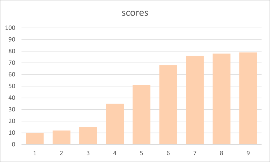
But data is frequently skewed to one side or the other. In the chart of scores above there appears to be a tail of lower scores and a peak on the right. this is said to have left or negative skewness.
To illustrate positive and right skewness, we plot a series of scores in another bar chart seen below.
Kurtosis
Finally, the data set can differ in distribution in an other manner. We can plot an even or normal distribution where the numbers are evenly distributed around the median.
A normal distribution is shown in the following line graph by the orange line. This rises, peaks in the middle and reduces in an evenly spread manner.
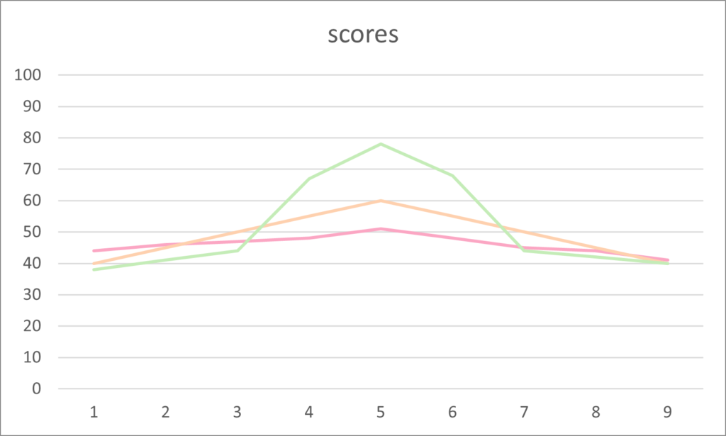
Positive kurtosis demonstrates an increase in the median as a higher peak. This is seen by the group of scores represented by the green line in the example above.
Finally, the flatter line with less fluctuation than the normal distribution, seen by the pink line, is called negative kurtosis. All three distributions are clearly shown in the following example.
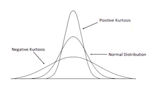
Source: daytrading.com, https://www.daytrading.com/kurtosis
There are also three types of kurtosis called Mesokurtic, Leptokurtic and Platykurtic. These can have similar appearances to the three distributions in the charts shown above.
Mesokurtic refers to a normal distribution, whilst Leptokurtic exhibits positive excess with potential high values of outliers. Finally, Platykurtic has flat tails and is said to show negative tendencies.
Box Plot
Now we know about the median and quartiles we can draw a box plot. There is a simple box plot that shows minimum and maximum values and there is a more advance box plot.
Here is a list of 20 numbers that add up to 400. Below is a box plot of these numbers created in Jamovi.
| 5 | 7 | 10 | 15 | 18 | 21 | 21 | 21 | 22 | 22 |
| 23 | 23 | 23 | 23 | 24 | 24 | 24 | 24 | 25 | 25 |
The box has a black line at the median which is 22.5. The minimum value is 5, the maximum value is 25, therefore the full range of the numbers is 20.
The box starts at the first quartile (Q1) which is 20.3, and ends at the third quartile (Q3) which is at 24.
The lines from the box are called whiskers and can be calculated from the interquartile range (IQR) which is Q3-Q1. In this case that would be 24-20.3= 3.7.
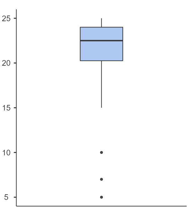
We can calculate that 1.5 multiplied by the IQR of 3.7 equals 5.55. We now use this figure to see if we have outliers, data points outside our new calculations.
If we add 5.55 to 24 we get 29.55, but our maximum number is 25 therefore our top whisker goes to the value 25. These are no high value outliers.
Now our lower Q1 figure was 20.3, subtract 5.55 equals 14.75. This is where the whisker is drawn, from the box at 20.3 to the point at 14.75.
We have three outliers with the values 5, 7 and 10 that are lower than our 14.75 figure.
Descriptive Statistics
Descriptive statistics are a set of statistics that give a brief summary of a data set.
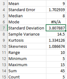
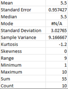
An example of descriptive statistics is seen in the following image that shows the summary statistics option from the Excel spreadsheet for the set of numbers from 1 to 10.
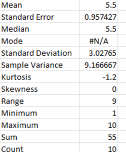
The instructions of how to get the summary descriptive statistics within Excel are given at the end of this article.
Simple statistics
The series of numbers from 1 to 10 have the lowest or minimum value of 1 and the highest or maximum value of 10. Adding all of the numbers together is called the sum (45) and the count of the numbers is how many numbers are in the series (10).
There are also measures of central tendency (mean, median, mode) and distribution figures that are explained above, such as range, skewness and kurtosis in the descriptive statistics.
Standard Deviation
Standard Deviation is a measure of the variation of a series of numbers in comparison to the mean average. Here is a series of numbers:
10 7 15 8 5
The sum of the numbers is 45 and the count of numbers is 5, therefore the mean average is 9. The difference between each number and the mean can be seen here:
+1 -2 +6 -1 -4
So we have the deviation from each element or value from the mean value (10-9, 7-9, 15-9, 8-9, and 5-9).
If we add up these values we get a total of 0, zero. But we want to see the difference, the deviation, of the values to the mean, so we need the lose the positive or negative sign for each figure.
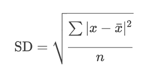
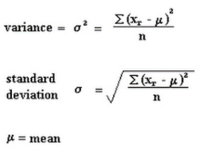
We can calculate the standard deviation by using the square root of the sum of the deviations squared, divided by the number of values.
The deviations squared are as follows:
1 4 36 1 16
The sum of these numbers is 58, and there are five numbers so 58 divided by 5 equals 11.6. The square root of 11.6 is 3.405877273, or 3.4 to one decimal place.
Therefore the standard deviation, written using the symbol σ, of the series of numbers 10, 7, 15, 8 and 5 is 3.4.
Why is the Standard Deviation Different?
In Excel the standard deviation for the series of numbers above is just over 3.8. Why is this different from the result of our calculations above?
When estimating the deviation of a population using a sample there is a different formula for the standard deviation that uses n-1 where n is the count of numbers.
In our example there are 5 numbers, but if we divide 58 by 4 and then get the square root of 14.5, the result is 3.8.
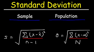
When estimating the standard deviation it is more accurate to use the different formula. So there are two methods to calculate the standard deviation.
Statistics relating to a population and a sample from that population are called inference statistics which will be explained later.
Difference between Standard Deviation and Variance
The standard deviation is the average difference between the values and the mean of the values, the variance is the squared average distance from the mean.
Descriptive Statistics in Excel
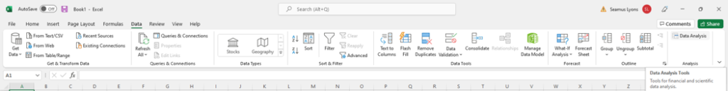
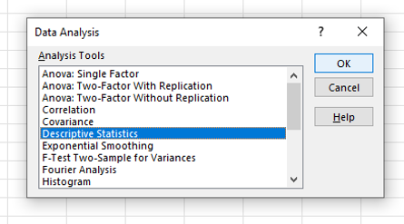
To view the descriptive statistics in Excel use the data analysis tool (far right-hand side) on the data menu option. Select descriptive statistics and press OK.
If there is a heading in the first row of the column of data then tick the option ‘Labels in First Row’.
Select the data in the Excel column as a range and this will be entered inside the box labeled ‘Input Range’, then choose ‘summary statistics’ by clicking the option box and select OK .
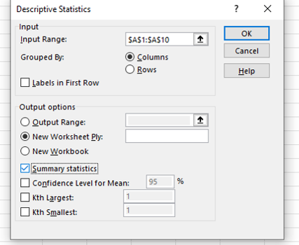
The summary descriptive statistics will appear in a new tab inside the Excel file.
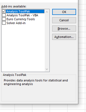
No Data Analysis Option
If the data analysis option does not appear in the data menu options then follow these instructions.

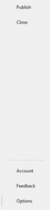
Start at the Home menu (first image above) and select options in the bottom left corner (second image above). In the box of Excel options that appears, select add-ons.
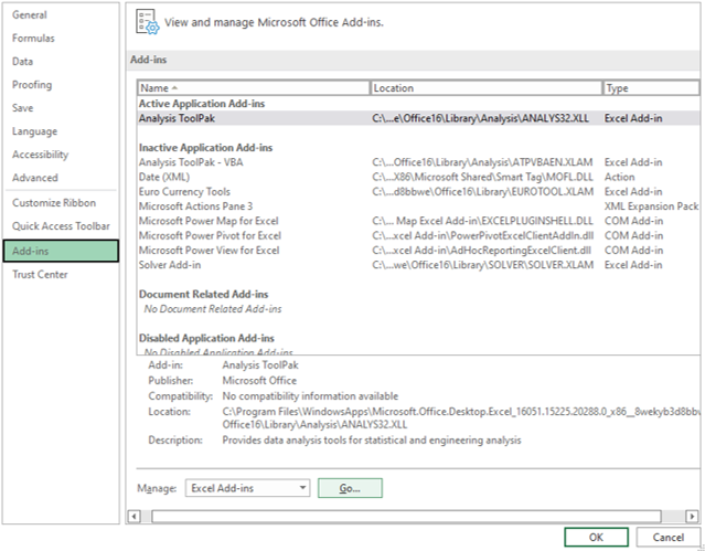
Click Go by the Manage Excel Add-ons at the bottom of the window. Now select the ‘Analysis ToolPak’ and OK and the option will be added.